Modern Touch-Friendly Design
May 21, 2020
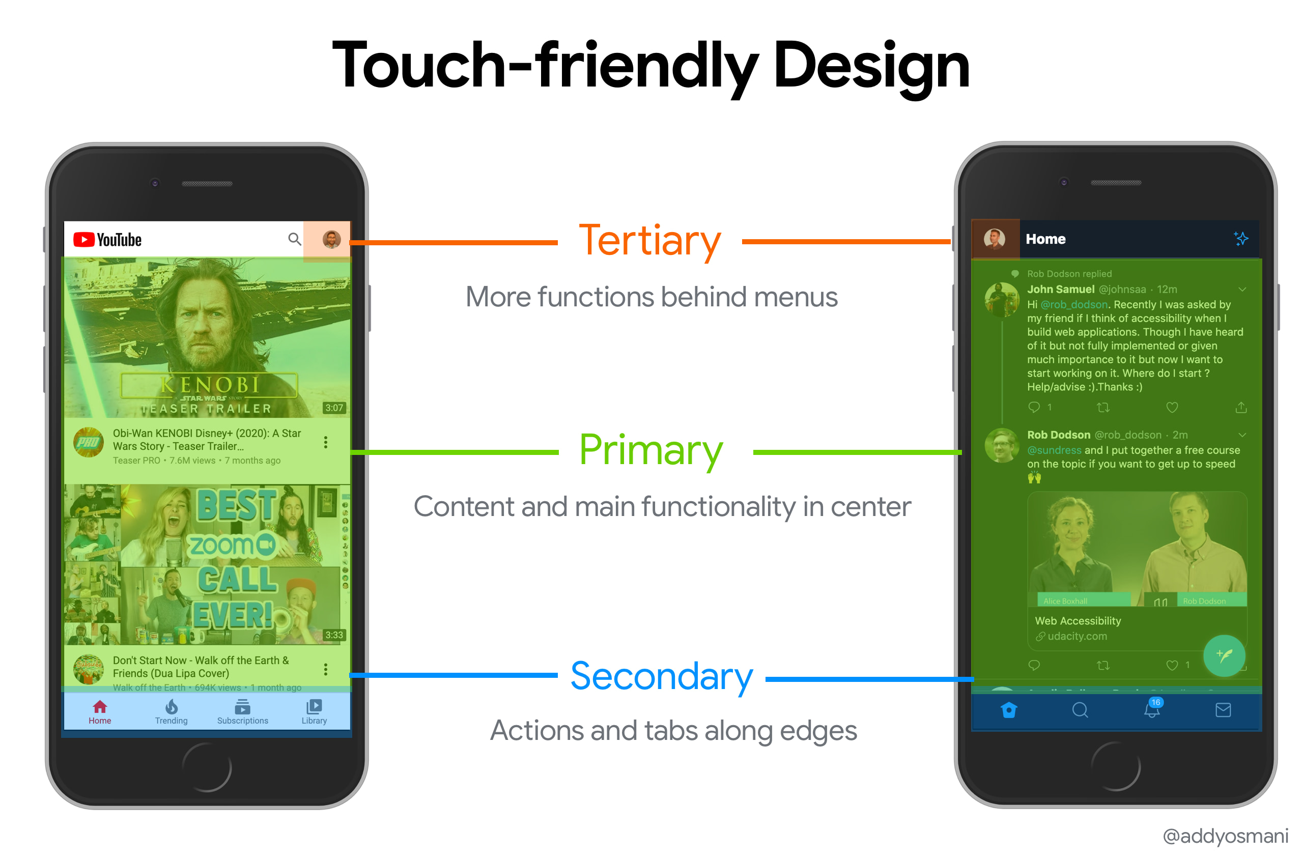
I recently spoke to veteran UX designer Steven Hoober about designing for touch interfaces. Hoober’s “Design for Fingers, Touch, and People” encourages UI designers to:
- Place primary content and actions at the center of the screen
- Place secondary actions and tabs along the edges
- Place tertiary functions behind menus
- Research how users perform specific interactions. Grip, task, context are all key.
These are touch-friendly guidelines I strive to follow for my apps and am happy to recommend to others. I’ve visualized these recommendations for YouTube and Twitter’s mobile sites:
Going deeper, Hoober’s heuristics for designing for touch in the real world are, on any device:
- Design for the different ways people use their devices, not just one way
- People look at the center of the screen - keep key content in the center
- People touch the center of the screen - center key actions if possible
- People only tap what they see - keep room around touch targets so users can tap and see state changes.
- People use different devices in different ways - gather data on how users use your UIs
Why care about this?
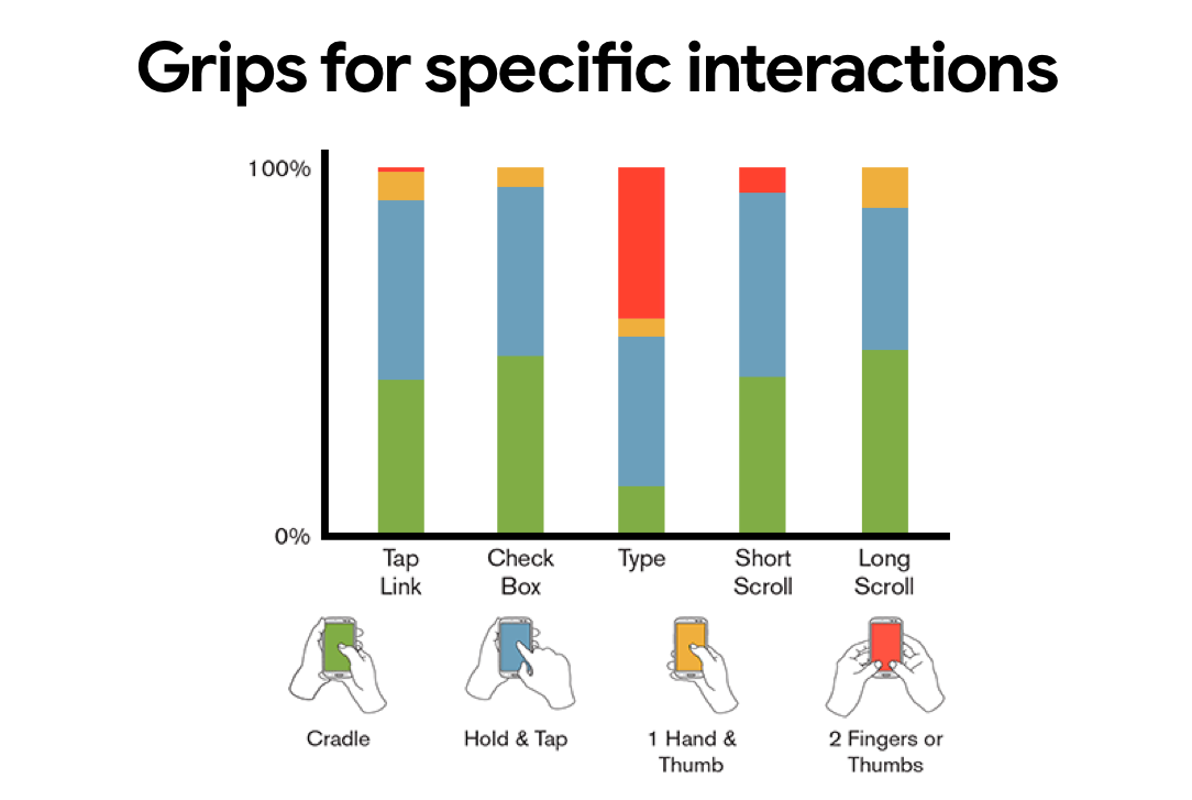
UX research into touch interaction suggests:
- 75% of users touch the screen with only one thumb.
- However, 49% of users use their phones with a one-handed grip, 36% hold it cradled (phone in one hand, tap with the other) and the other 10% use it with both thumbs. This makes that 75% number slightly misleading.
- 67% of one-handed use is with a right thumb and 33% with left.
Hoober’s been a pivotal voice in interaction design for over a decade, having driven early work with the likes of Josh Clark leading to the “The Thumb Zone”. The Thumb Zone was once viewed as the most comfortable area to touch a screen with one-handed. However, avoid the Thumb Zone in 2020!.

In recent years, our understanding of how people grip and touch mobile phones and tablets has become significantly more nuanced. It doesn’t make sense to assume every user interacts with a phone in the same way (as the Thumb Zone encourages), but there are newer guidelines Steve’s research over years has captured that I like to follow.
Users interact with their phones in many different ways. It’s essential to design for the variable ways users use their devices and not just one way. It’s common for users to change their phone grip for different types of interactions, based on the task and context. In addition, by moving their fingers, users can change the area of the screen their thumb can reach.
Users really like the center of the screen!
Hoober’s studies highlighted that when given the choice, users preferred to move content to a position in the center of the screen and would then tap it. He suggests that key items you can read or click should be in the center of the screen while secondary options providing path to other screens (routes) are placed along the top and bottom of the screen.
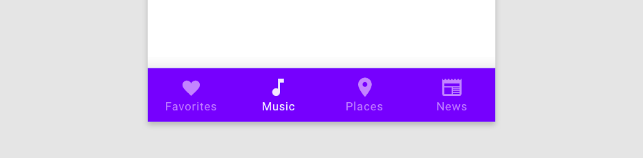
This is one of the reasons why Material Design’s suggestions, like the Bottom Bar, work well. Bottom navigation bars are closer to the edges and provide comfortable access to key actions. It’s perhaps unsurprising that in recent years, bottom navigation patterns have increased in popularity.
Wrapping up…
I can’t recommend reading Hoober’s guidelines enough. Check-out parts one, two and three. They’re excellent!
Further Reading
- Steven Hoober - Design for Fingers, Touch, and People
- A List Apart - How we hold our gadgets?
- UXMatters - How do users really hold mobile devices?
- Smashing Magazine - Thumb zone - designing for mobile users
- LukeW - Designing for large-screen smartphones
- Josh Clark - Designing for Touch