Adaptive Loading - Improving web performance on low-end devices
December 29, 2019
Adaptive Loading is a web performance pattern where sites not just respond based on screen size - they adapt based on actual device hardware.
Any user can have a slow experience. In a world with widely varying device capabilities, a “one-size” fits all experience may not always work. Sites that delight users on high-end devices can be unusable on low-end ones, particularly on median mobile and desktop hardware and in emerging markets. What if we could adapt how we deliver pages to better cater for our user’s constraints?

In our Chrome Dev Summit talk, Facebook’s Nate Schloss and I talk about Adaptive Loading - this pattern …
- Delivers a fast core experience to all users (including low-end devices)
- Progressively adds high-end-only features, if a user’s network and hardware can handle it.
This allows users to get an experience best suited to their constraints.
Use cases
The full list of use-cases adaptive loading unlocks include:
- Serving low-quality images & videos on slow networks
- Loading non-critical JavaScript for interactivity only on fast CPUs
- Throttling the frame-rate of Animations on low-end devices
- Avoiding computationally heavy operations on low-end devices
- Block 3rd-party scripts on slower devices

Zooming in on some of these ideas…
Adaptive Media Loading
Adaptive media loading aims to serve low-quality images and videos to reduce bandwidth and memory consumption.

For sites relying heavily on media, this could mean:
- A photo gallery application may deliver lower resolution previews, or use a less code-heavy carousel mechanism.
- A search application may return fewer results at a time, limit the number of media-heavy results, or reduce the number of dependencies required to render the page.
- A news-oriented site may surface fewer stories, omit less popular categories, or provide smaller media previews.
While conditionally serving different resources based on device capabilities is a good strategy, sometimes it can be even better to not serve a resource at all and adaptive loading unlocks this choice.
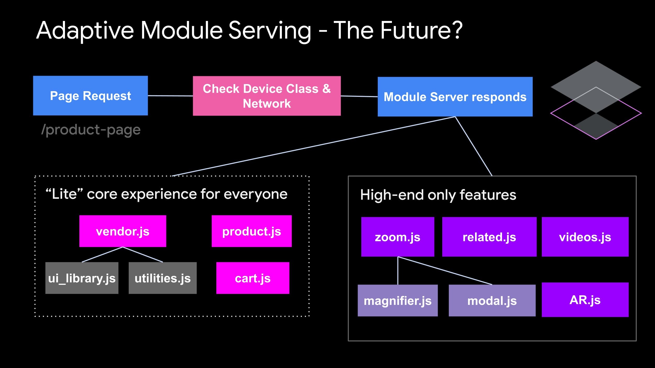
Adaptive Code-Splitting & Code Loading
Adaptive code loading is all about shipping a light, core interactive experience to all users and progressively adding high-end-only features on top…if a users hardware can handle it. It’s this device-awareness that takes progressive enhancement one step further.
On high-end devices, we can conditionally load even more highly interactive components or run more computationally heavy operations, while not sending these scripts down if you’re on a slower device.

Adaptive data-fetching and pre-fetching.
Whether it’s on the server or client, reducing the quantity of data being requested can contribute to decreasing overall latency. Adaptive data-fetching can use signals like slow network to send fewer results down to users. You can use these same signals to throttle how aggressively you prefetch.

Signals for adaptive serving & loading
There are a number of signals we can use for Adaptive Loading, including:
- Network - for fine-tuning data transfer to use less bandwidth (via
navigator.connection.effectiveType). We can also leverage the user’s Data Saver preferences (vianavigator.connection.saveData) - Memory - for reducing memory consumption on low-end devices (via
navigator.deviceMemory) - CPU core count - for limiting costly JavaScript execution and reducing CPU intensive logic when a device can’t handle it well (via
navigator.hardwareConcurrency). This is because JavaScript execution is CPU bound.
In our talk, we cover real-world examples of these ideas being used in sites such as Facebook, eBay, Tinder and others. Check out 24mins in where Nate walks through how Facebook uses some of these ideas in production, via device grouping:

React Hooks for adaptive loading
We also released a new (experimental) set of React Hooks & Utilities for adding adaptive-loading techniques to your React apps.
Our hooks/utilities include the useNetworkStatus React hook for adapting based on network status (effective connection type):
import React from 'react';

import { useNetworkStatus } from 'react-adaptive-hooks/network';

const MyComponent = () => {
  const { effectiveConnectionType } = useNetworkStatus();

  let media;
  switch(effectiveConnectionType) {
    case '2g':
      media = <img src='medium-res.jpg'/>;
      break;
    case '3g':
      media = <img src='high-res.jpg'/>;
      break;
    case '4g':
      media = <video muted controls>...</video>;
      break;
    default:
      media = <video muted controls>...</video>;
      break;
  }

  return <div>{media}</div>;
};
The useSaveData utility for adapting based on the user’s browser Data Saver preferences:
import React from 'react';

import { useSaveData } from 'react-adaptive-hooks/save-data';

const MyComponent = () => {
  const { saveData } = useSaveData();
  return (
    <div>
      { saveData ? <img src='...' /> : <video muted controls>...</video> }
    </div>
  );
};
…and the useHardwareConcurrency utility for adapting based on the number of logical CPU processor cores on the user’s device:
import React from 'react';

import { useHardwareConcurrency } from 'react-adaptive-hooks/hardware-concurrency';

const MyComponent = () => {
  const { numberOfLogicalProcessors } = useHardwareConcurrency();
  return (
    <div>
      { numberOfLogicalProcessors <= 4 ? <img src='...' /> : <video muted controls>...</video> }
    </div>
  );
};
Go forth and experiment!
In the future, we hope to see more examples of infrastructure that can automatically deliver the most optimal bundles of code based on a user’s network & device constraints. Between Client Hints and the client-side APIs used above, the building blocks to build something compelling in this space may already exist :)
We hope you’ll find Adaptive Loading an interesting addition to your Progressive Enhancement toolbox. Check out our talk to learn more :)
Further reading
- React Adaptive Loading hooks and utilities
- Sophisticated Adaptive Loading Strategies from Tinder Web engineering
- Connection-Aware Components in Angular
- Serving Adaptive Components Using the Network Information API with Vue and Web Components
- Adaptive serving based on network quality
Originally published on my dev.to account