Generate multi-resolution images for srcset with Grunt
August 27, 2013
As Mat Marquis recently summarized on SmashingMag, the srcset attribute allows developers to specify a list of sources for an image that are delivered depending on the pixel density of a user's screen. An example of how srcset may be used is as follows, where we define three different image sources for the resolutions we wish to target:
<img alt="My photo"
     src="photo.jpg"
     srcset="photo-HD.jpg 2x, photo-phone.jpg 100w,
             photo-phone-HD.jpg 100w 2x">
In practice, you may wonder how you're going to go about generating images of the correct resolution in order to implement something like the above in our own pages.
This is where grunt-responsive-images, a Grunt task by Andi Smith, comes in useful. The task takes your original source images and generates images at different (pre-specified) resolutions which you can use with srcset. Technically, it will generate images correctly if you wish to use it with PictureFill and Imager.js too.

Getting started
Installing and configuring the task should took me less than 10 minutes. Assuming you have Grunt 0.4 (or higher) installed:
- From your project root, run
npm install grunt-responsive-images --save - Add the task to your Gruntfile:
grunt.loadNpmTasks('grunt-responsive-images'); - Next, you'll need to install ImageMagick (which handles the actual image export process). On Mac, run
brew install ImageMagickusing Homebrew and on other platforms follow the instructions on the binary releases page. Note: I had to separatelybrew install --force jpegfollowed bybrew install --force imagemagickto get this working. - Finally, you should be able to configure the task to suit your needs.
Configuration
Here's what the default configuration for the task looks like, which does not require any additional sizing configuration to function:
grunt.initConfig({
  responsive_images: {
    dev: {
      files: [{
        expand: true,
        src: ['app/img/**/*.{jpg,gif,png}'],
        cwd: 'src/',
        dest: 'dist/'
      }]
    }
  },
})`
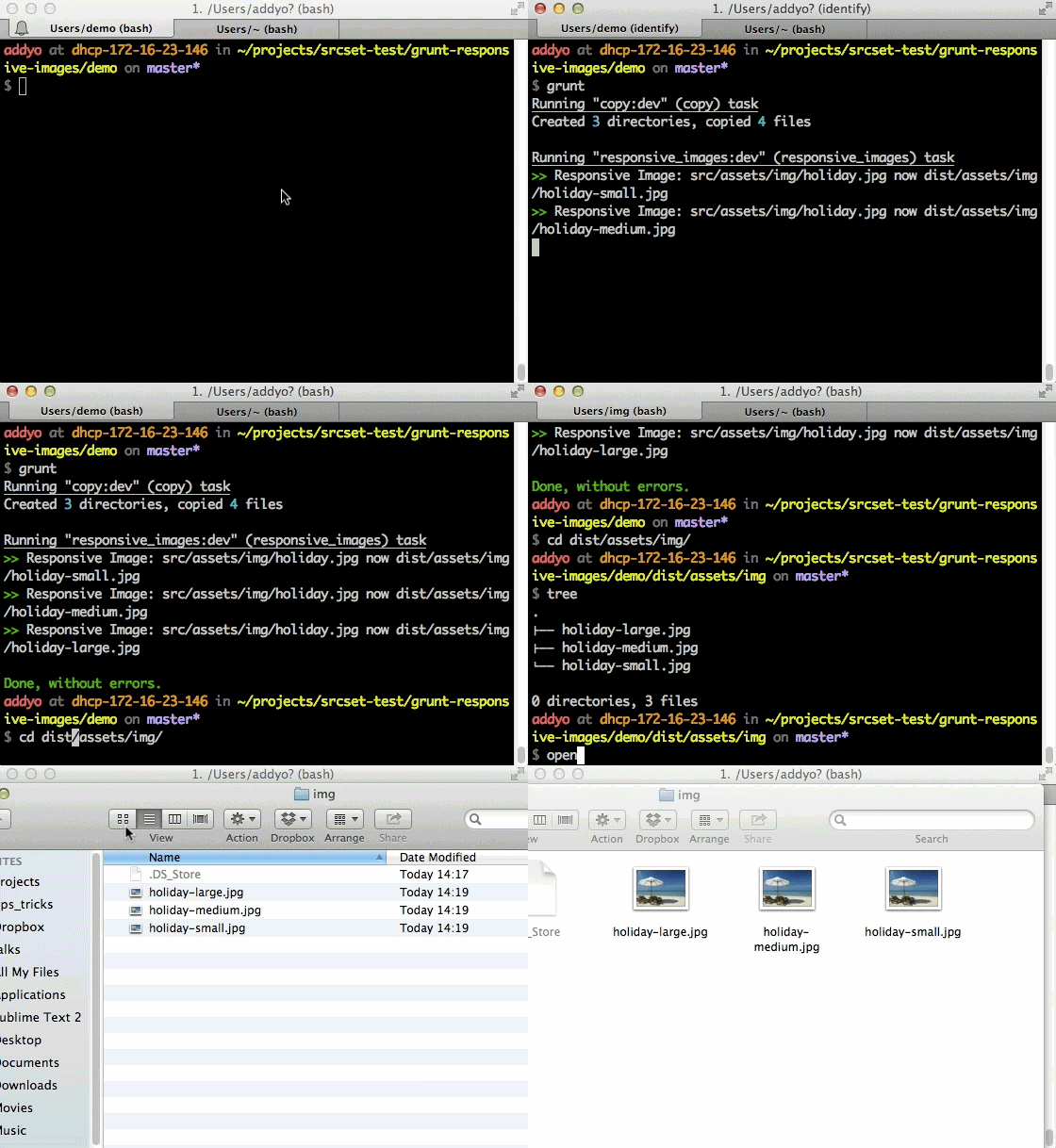
This takes as input an image, say photo and produces
- photo-small.jpg
- photo-medium.jpg
- photo-large.jpg
That said, it is highly likely you'll want more control over how the task is configured, but luckily a number of customization options are supported:
sizes- representing an array of objects for each size typesizes[].width- image widthsizes[].height- image heightsizes[].name- image size namesizes[].suffix- suffix for retina graphicssizes[].quality- image quality for JPGsseparator- character used to separate the filename
e.g:
sizes: [{
        name: 'small',
        width: 320,
        height: 240
      },{
        name: 'medium',
        width: 640
      },{
        name: "large",
        width: 1024,
        separator: "-"
        suffix: "_x2",
        quality: 0.6
      }]
As per Andi's deck on this task, if you specify both the width and height the image may be cropped.
Here's another sample configuration where we configure two image sizes and a retina image for larger displays, then copy over our 'responsive' images post generation:
grunt.initConfig({
  responsive_images: {
    dev: {
      options: {},
      sizes: [{
        width: 320,
        height: 240
      },{
        name: 'large',
        width: 640
      },{
        name: "large",
        width: 1024,
        suffix: "_x2",
        quality: 0.6
      }],
      files: [{
        expand: true,
        src: ['app/img/**/*.{jpg,gif,png}'],
        cwd: 'src/',
        dest: 'dist/'
      }]
    }
  },
  copy: {
    dev: {
      files: [{
        expand: true,
        src: ['**/*', '!app/img/**/*.*'],
        cwd: 'src/',
        dest: 'dist/'
      }]
    }
  }
});

grunt.loadNpmTasks('grunt-contrib-copy');
grunt.loadNpmTasks('grunt-responsive-images');

grunt.registerTask('default', ['copy','responsive_images']);
Using the task with Imager.js
As mentioned earlier, you could also use this task alongside Imager.js. Pass in the widths you'll be generating with the task while creating a new instance of Imager and you can serve them up at the desired end-point.
<div class="delayed-image-load"
    data-src="images/320" data-width="320"></div>
<script src="Assets/Scripts/Imager.js"></script>
<script>
  var imager = new Imager({
    availableWidths: [320, 640, 1024]
    });
</script>
Should you wish to just reference images/320.jpg rather than images/320, you can pass a custom regular expression into Imager via the regex option.
Demo
That's about it. Andi put together a demo that uses his task and the srcset/PictureFill polyfill that's worth checking out. You'll get the source for this when you do a git clone of the project repo.
Notes
- Some developers may prefer the ability to just use
srcsetin their markup then have a task read from that and create the corresponding images using thesrcsetinfo. This would be ideal however until such a task is available I think Andi's task may still be of value to some. - At this time, the polyfill for
srcsetmay download multiple sizes of images being included (rather than just the correct one) so I can only advise using this in conjunction with browsers with natively supportsrcset. You can of course still use this technique with an alternative responsive images solution like Imager.js for the time-being. - Sindre Sorhus has created a complimentary module for parsing and stringifying
srcsetwhich you may also find of interest.