Visualising JavaScript Processing Over Time With DevTools Flame Charts
August 29, 2013
In this quick video, I walk through how to effectively use DevTools Flame Charts for visually representing your app's JavaScript processing over time. This can be useful if you're concerned it may be suffering from particularly long function executions and you want to dive into them further.
Flame Charts compliment the existing JavaScript CPU Profile's Tree and Heavy views, displayed lower down. For those unfamiliar with the CPU profiler, it shows where CPU time is statistically spent on your code.
[caption id="attachment_5762" align="aligncenter" width="808"]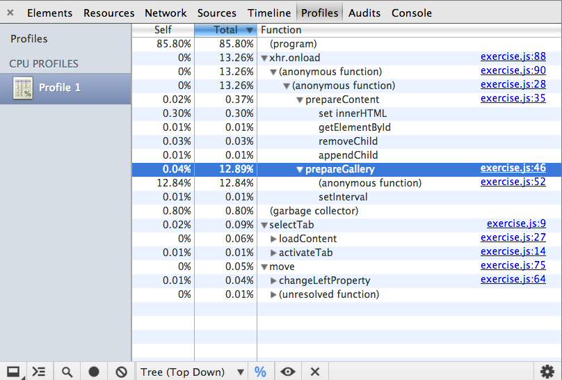 Tree view (Top Down)[/caption]
[caption id="attachment_5763" align="aligncenter" width="806"]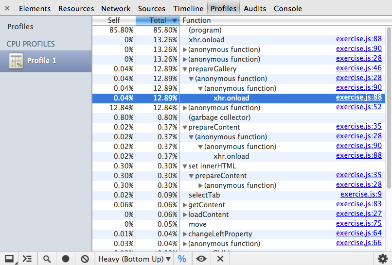 Heavy view (Bottom Up)[/caption]
[caption id="attachment_5766" align="aligncenter" width="807"]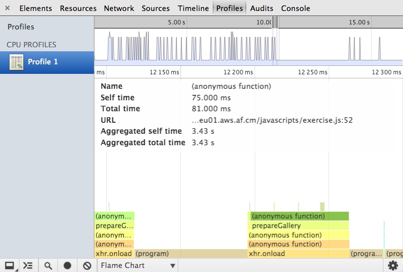 Flame Chart view (same app)[/caption]
[caption id="attachment_5788" align="aligncenter" width="1108"]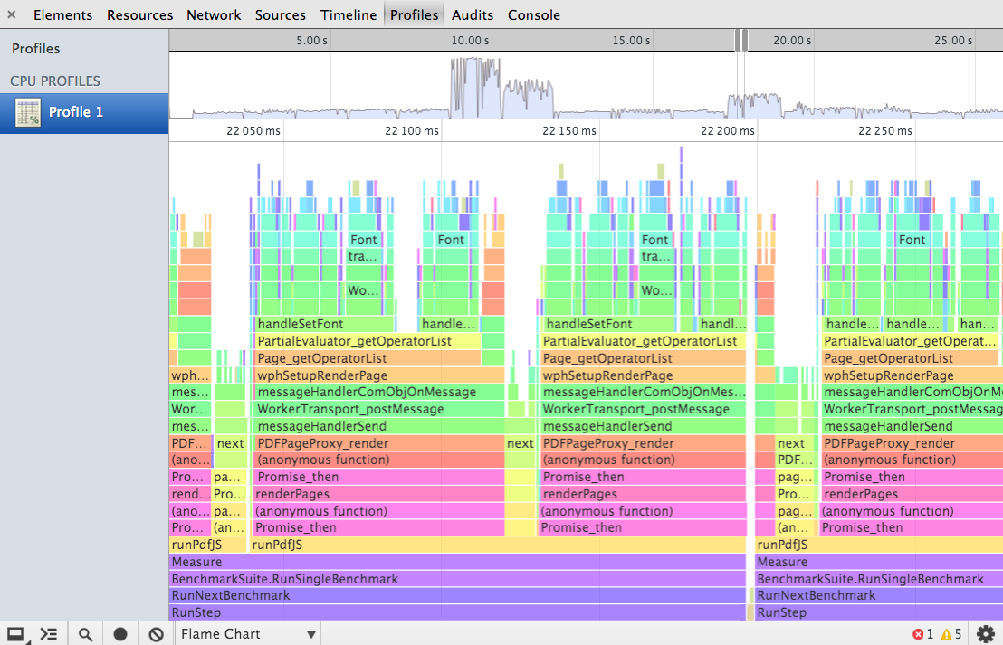 Flame Chart view (for a more complex example - the Octane benchmark)[/caption]
[caption id="attachment_5814" align="aligncenter" width="1234"]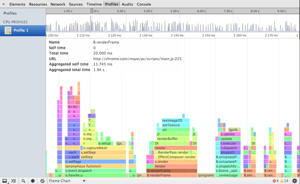 Flame Chart for a segment of the Chrome Maze experiment[/caption]
[caption id="attachment_5784" align="aligncenter" width="1019"]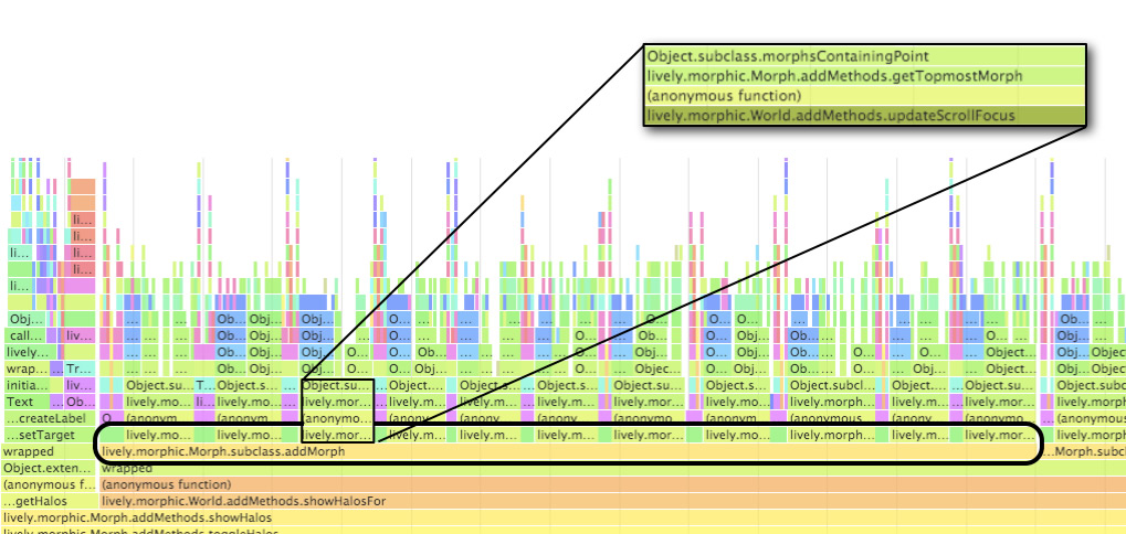 Noticing particularly long (and repeat) function executions which can be optimised.[/caption]